Thanks to its iconic Google Doodles, users of the search engine are used to seeing a homepage that looks a little different from day to day. But Tuesday’s change is one that will stick.
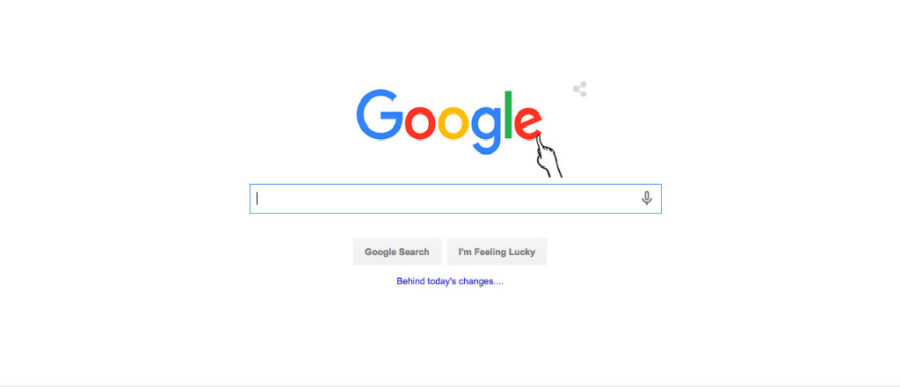
In its biggest shift in 16 years, Google unveiled a new logo that the company also says is indicative of where the company — and technology — are headed next.
The new sans-serif logo is “a lot more modern and playful” than the old and, while still the same combination of blue, red, yellow and green, “the colors are softer than they used to be,” The Verge reported. The change also links together Google and the logo of its new parent company, Alphabet.
Perhaps most importantly, the new Google logo is optimized for the way people use the Internet today — i.e., not always (and maybe even not mostly) on computers. For example, going sans-serif wasn’t just a design preference; sans-serif type also shrinks down to smaller (read: mobile) sizes better than its serif brethren.
The logo “doesn’t simply tell you that you’re using Google, but also shows you how Google is working for you,” the company said in a blog post announcing the change. “For example, new elements like a colorful Google mic help you identify and interact with Google whether you’re talking, tapping or typing.”
Functionally, it’s a change that makes a lot of sense. But will it change what users think of Google? We looked back at some past Knowledge at Wharton stories to see what Wharton experts and others had to say about strategy for logos:
A logo change is often about communicating some other type of change: Google is trying to make itself more responsive to the way the web works today, and highlight its new “more than just technology and the Internet” parent company, Alphabet. Similarly, Starbucks dropped the company name and the word “coffee” from its logo in 2011 in part because the company’s expansion goals went far beyond $4 lattes. The company was also looking to further expand overseas, and a verbiage-free logo avoids the complication of translating its name into the languages used in future markets.
Some logo changes are successful: In a 2011 story about the Starbucks logo change, Wharton marketing professor Patti Williams gave the example of Apple, which migrated from a multi-colored apple that highlighted the company’s strength in computer graphics to the silver apple. “They very deliberately moved toward that lightness,” she said. “There is something ethereal about the brand. It is clean and spare, but not sterile.” And the company also dropped the word “computer” from its name in 2007 to reflect Apple’s broad offering of devices, including the iPhone and iPod.
“[Apple] very deliberately moved toward that lightness. There is something ethereal about the brand. It is clean and spare, but not sterile.”–Patti Williams
Others? Not so much: Remember Gap’s new logo? The retailer probably wishes that you didn’t. The 2010 change was “a disaster,” Wharton marketing professor Cassie Mogilner told Knowledge at Wharton for the 2011 Starbucks story. “They changed it altogether, and it didn’t communicate what we know to be the Gap brand.” That new logo was swiftly dumped in favor of the old.
Logos can inspire people — in good and not-so-good ways: A 2008 study by Duke University’s Gavan Fitzsimons found that people demonstrated higher levels of creativity after viewing the Apple logo.
Logos are a lot like badges, Wharton marketing professor Americus Reed told Knowledge at Wharton in 2011 — they’re a symbol people wear to show their connection to a larger group. But that’s also why even small changes can have big consequences. Reed pointed to the experience of the Adolph Coors brewing company, which changed the tagline on its beer from “Banquet Beer” to “Original Draft” back in 1988. While the beer itself had not been changed, many customers wrote the company complaining about the new taste. “That label change created the perception the product had changed — when it had not,” Reed said.
The rules aren’t the same for everyone: In a 2011 story about the power of Google Doodles, Wharton marketing professor Jonah Berger said it’s easier for Google as a web-based company to regularly alter its logo because it’s something that consumers encounter every day.
“[The logo] is drawing people to look at it because it is changing,” Berger said. “People will wonder what it will be today and what it will be tomorrow. It gets much more attention than it would get otherwise.” A company like Yahoo could do something similar, Berger added, but firms such as General Electric or Ford would find a changing logo difficult to pull off because “people wouldn’t necessarily go to those websites every day.”
Change can get consumers to sit up and pay attention — but companies won’t get much out of consumers who don’t also recognize which brand is speaking to them.
But consistency is still key: Change can get consumers to sit up and pay attention — but companies won’t get much out of consumers who don’t also recognize which brand is speaking to them. Google Doodles nearly always use a palette of the company colors, Wharton marketing professor David Reibstein said in the same article. Nike has used many different colors for its logo, but the iconic “swoosh” remains the same. Snickers launched an ad campaign several years ago that employed its iconic logo style, but substituted hunger-related words like “nougetaboutit” for the candy bar’s name, Reibstein added.