Starbucks has emerged over the last 20 years as one of the premier consumer brands in the world, alongside icons like Apple and Nike. Now, the company has decided to give that brand a facelift, revamping its ubiquitous logo. While logo overhauls can successfully communicate a company’s evolution and growth, those changes are also fraught with peril. Redesigns that are poorly conceived, or considered too radical, have triggered a backlash among loyal customers, the very people who give the brand its power. In the case of Starbucks, the new logo highlights a strategic shift for the company — but it has also sparked criticism from many outspoken fans.
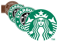
The new Starbucks logo is an obvious departure, but not a radical shift, from the logo that has adorned the coffee chain’s cups since 1992. It retains the company’s signature siren (a twin-tailed mermaid figure) still in the traditional Starbucks green. When Starbucks was founded in the 1970s, the mermaid was selected as a nod to the seafaring nature of the coffee business (the chain’s namesake is Starbuck, the first mate character on the whale ship depicted in Herman Melville’s Moby-Dick). But gone are the words “Starbucks” and “Coffee,” a move that highlights the company’s expansion plans.
Wharton marketing professor David Reibstein says retaining the green color for the logo was critical. “You can show that color, and people will recognize it as Starbucks. That color is really important to them. In a similar way, Apple has taken the most benign color, white, and owned it. You see that white cord running from someone’s pocket to their ears and everyone knows they are ‘cool’ because they are using an iPod.” According to Reibstein, the siren itself is secondary to the color. “I teach a case about Starbucks, and one of the things I ask is, ‘What is on the logo and why?’ Many people don’t even know it is a mermaid.”
The deletion of the words “Starbucks Coffee” from the logo is obviously significant. Dispensing with a direct connection to coffee signals that the chain, which sells sandwiches, baked goods, music and other products in its stores as well as branded coffee through supermarkets, is angling to diversify further. “Our brand identity will give us the freedom and flexibility to explore innovations and new channels of distribution that will keep us in step with our current customers and build strong connections with new customers,” founder and CEO Howard Schultz wrote on the company’s website in early January.
At the same time, dropping the name altogether plays to the company’s global ambitions. In the spring of 2010, Schultz said Asia represented the company’s biggest growth opportunity and that the chain would ultimately open thousands of stores in China. In early 2011, the company also announced plans for entering the market in India. With no verbiage on the new logo, the company avoids the complication of translating its name into the languages of those countries as well as other future markets.
Of course, there are potential downsides to stepping away, even subtly, from what made Starbucks a sensation in the first place. According to Wharton marketing professor Jonah Berger, other companies have made similar moves to make their brands less narrow, including Kentucky Fried Chicken, which dropped a direct link to chicken by becoming KFC, and Dunkin’ Donuts, which has favored the Dunkin’ half of its name in a bid to become less identified with just breakfast snacks. “You think about coffee when you think about Starbucks, and that can be restricting,” Berger notes. “But the danger is they become so watered down in so many categories that the brand has no strength, that they become known for nothing.”
Bryant Simon, a Temple University professor of history and author of a book on Starbucks, argues that the company is making a mistake in taking the word coffee off its logo. Simon says the company moved away from its coffee roots in the mid 2000s, an ill-fated maneuver that prompted founder Schultz to return to the chain and refocus on the basics. “They are saying they want to move beyond coffee, but that didn’t work once before,” Simon states, adding that while Starbucks is trying to give its brand a more modern, cutting-edge feel, that does not play to the company’s strengths. “People buy Starbucks’ products for their predictability and dependability, not because it is a status symbol. This is a mature, successful brand that is trying to act like a teenager.”
For others, the more controversial move is dumping the Starbucks name from the logo. Gary Stibel, founder and CEO of the New England Consulting Group, says, “There are places in the U.S., and many places around the world, where people don’t know the Starbucks name.” And he points out that unlike the logo for Apple, the siren is not a simple visualization of the company name. “To walk away from the Starbucks name when you don’t have to is a serious marketing mistake.”
A Badge of Recognition
While some may not be fans of the new direction, brand experts note that the redesign is an understandable effort by the company to mark a new phase in its history and a break with the difficulties of the last few years. After expanding rapidly, Starbucks was forced to slam on the brakes and retrench in 2008. Within months of retaking the helm, Schultz announced the chain was shuttering 600 stores (about 800 were ultimately closed) and laying off thousands of workers. Tony Spaeth, president of brand consulting firm Identity Works, says the brand overhaul is as important for employees as it is for customers. Those employees, according to Spaeth, have been through a lot of turmoil over the past several years and the rebranding is a way to reenergize the troops, who “in many ways are more familiar with the problems [than customers].”
The logo redesign by Starbucks is one of many overhauls by well-known companies in recent years, some successful and others less so. “We have seen the redesign of many visual brands over the last couple years as the role of packaging and aesthetics have become increasingly important,” according to Patricia Williams, a Wharton marketing professor. She says the rebranding has been driven by the realization that “the point when [customers] are standing in front of the shelf [examining the product] may have more impact than the ad you saw three days ago.” In many cases, including the Starbucks revamp, those logo changes were toward a simpler, more streamlined design. Identity Works’ Spaeth notes, “If it is simple, you see it quickly and you get it — you are not trying to make sense of several different ideas at once.”
There is no doubt the right symbol can be powerful. Wharton marketing professor Americus Reed II says logos are like badges, a symbol people wear to show their connection to a larger group. And he says even small changes to packaging can change how people view a product. Reed points to the experience of the Adolph Coors brewing company, which changed the tagline on its beer from “Banquet Beer” to “Original Draft” back in 1988. While the beer itself had not been changed, many customers wrote the company complaining about the new taste. “That label change created the perception the product had changed — when it had not,” Reed notes.
In fact, research has shown the impact a strong brand can have on consumers, even subconsciously. Gavan Fitzsimons, a professor of marketing and psychology at Duke University’s Fuqua School of Business, published a paper in 2008 that studied how 800 people responded to various logos. In the study, people were shown a logo on a screen so quickly that it did not register consciously that they had seen it. Then Fitzsimons gave them a test to measure their creativity, such as a challenge to come up with a long list of uses for an object like a brick. Those people who had viewed the Apple logo were 30% to 40% more creative than those who did not see the logo. (People who had been shown the IBM logo actually showed less creativity than those who had seen no logo.) “When you see the Apple logo, that triggers a series of associations in your mind with things like creativity and innovation,” Fitzsimons states. “And once those ideas are activated in your mind, it also activates in you a goal to be more creative.”
Altering a logo can create a backlash, particularly among consumers who closely identify with the brand. Vikas Mittal, a marketing professor at Rice University’s Jones Graduate School of Business, and two other co-authors published a paper in 2010 in the Journal of Product and Brand Management that found that consumers who were most attached or committed to a brand tended to react negatively to a logo change, while less loyal customers tended to react positively. And the dislike for the new logo among committed customers also dampened their enthusiasm for the brand in general. In fact, committed customers had three times more negative thoughts about a brand after a redesign than non-committed customers did. And for those committed customers, the likelihood that they would purchase the brand decreased after a redesign. “Those committed customers have a strong connection to the brand and logo,” says Mittal. “Any change in the logo is seen as a threat.”
Out With the New, Back With the Old
Those dangers have been borne out by the experience of some companies with a logo redesign. Wharton’s Williams points to the new package and logo Tropicana rolled out in 2009. The orange with a straw coming out of it, which had been the brand’s trademark, was ditched in favor of a package that still had the Tropicana name, but had a bland orange and white design. “The packages were too clean, too spare and too generic,” Williams notes. “It was a fairly radical change.” After an outcry from irritated consumers, Tropicana went back to the old logo.
A similar debacle was seen when Gap unveiled a new logo in 2010. Gone was the traditional blue box with the “Gap” printed in white. The new logo was the word “Gap” in black with a small blue box over the letter p. “That was a disaster,” says Wharton marketing professor Cassie Mogilner. “They changed it altogether, and it didn’t communicate what we know to be the Gap brand.” That new logo was swiftly dumped in favor of the old.
Still, logos can evolve in ways that strengthen a brand. Many point to Apple, which migrated from a multi-colored apple that highlighted the company’s strength in computer graphics to the silver apple. “They very deliberately moved toward that lightness,” says Wharton’s Williams. “There is something ethereal about the brand. It is clean and spare, but not sterile.” And the company also dropped the word computer from its name in 2007 to reflect Apple’s broad offering of devices, including the iPhone and iPod.
Williams also points to Walmart’s new logo in 2008 as a success. “The old logo had the name in upper case, blocky letters which made them look like a big mouth behemoth,” Williams states, noting that in the world of social media, typing in all caps is the equivalent of shouting. “Now everything but the ‘W’ is in lower case and the color is a lighter blue, which makes [the brand] seem more gentle and approachable.” She says the logo was effective in signaling a shift at Walmart. “They had an image as the bully in the room. This redesign reflected a concern they were hearing from customers and they addressed it in a visual way.”
In fact, Starbucks’ new logo may be in part aimed at boosting its expansion efforts in Asia. In a soon-to-be-published paper co-authored by Rice’s Mittal, researchers found that more rounded logos were favored by people from interdependent, collectivist cultures, including many countries in Asia, while angular logos were more popular in individualistic cultures, such as the U.S. As a result, Mittal says Starbucks’ new logo — which is less angular than the old one — is more likely to appeal to new customers in places like China.
Still, Mittal and others argue that Starbucks missed an opportunity with the new logo. Sundar Bharadwaj, a marketing professor at Emory University’s Goizueta Business School, points out that with the explosion of social media, customers can communicate quickly about a new logo. That is why he thinks “firms should bring people into this process of change from the beginning, and start a real conversation with them.” Mittal agrees. “It is important to put a process in place that minimizes the downside of a logo redesign. That would involve warning customers about the change, showing them different proposed logos and allowing them to comment on them.”
Despite lack of such an effort, the Starbucks logo redesign is unlikely to spark the backlash that other overhauls have. The change is not radical and many of the familiar elements remain. “It doesn’t seem like a home run,” says Wharton’s Williams. “But it doesn’t look like a disaster either.”