From the Nike swoosh to the Starbucks siren, logos are one of the most instantly recognizable parts of any brand. Many logos have become icons unto themselves, and the public feels deeply attached to them – so much so, that companies often face significant backlash when they try to make a change. The task of designing a logo has historically been viewed as an art more than a science, but a new paper by Wharton marketing professor Ryan Dew proposes a more data-driven approach. He recently spoke with Knowlege@Wharton about his findings, which are outlined in the paper, “Letting Logos Speak: A Machine Learning Approach to Data-driven Logo Design.” The paper was co-authored with Asim Ansari and Olivier Toubia, both professors at Columbia Business School.
An edited transcript of the conversation follows.
Knowledge at Wharton: Why are logos so important for brands?
Ryan Dew: Logos are kind of the visual figurehead of any brand. They are the thing that maybe sticks out the most in your mind when you’re thinking about any firm, any brand — think McDonald’s, Starbucks. You think immediately of those golden arches, the green mermaid — all these different things. They’re both the thing you think of, and they’re the thing that the company puts everywhere on its products. And so designing a logo that really conveys the essence of a brand is pretty important for a firm to get right.
Knowledge at Wharton: Your paper takes a data-driven approach to looking at this, specifically using machine learning. Why is this a little bit different from how we typically look at logos?
Dew: Typically, I think that people, and even academics, view design as this kind of “other thing” — this sort of esoteric idea that there’s not really data that can speak to this, that you need to have an artistic grasp that is beyond the world of data. And you know, to be frank, I think I also agree with that. It’s important to have that artistic sense, but what we’re trying to convey in this project is that there’s actually a science to it, too. There are things that data and models can say about the design process that can help firms develop brand identities — visual brand identities that are doing the right things for them.
Knowledge at Wharton: You looked at hundreds of logos for this paper. What did you find?
Dew: The idea behind this project is sort of conveyed in the title, which is “Letting Logos Speak.” Specifically, we looked at hundreds of different logos, and we also looked at a bunch of textual data describing these firms — taken mostly from the firms’ websites. And we also got consumers to react to these logos and the textual descriptions by rating these firms according to what’s called a “brand personality scale.” That is, if you imagine this firm as a person, would this person be friendly? Would this person be honest? Would this person be hard-working? — as a measure of trying to get at the essence of the brand.
“Designing a logo that really conveys the essence of a brand is pretty important for a firm to get right.”
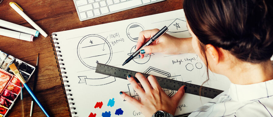
So we have all this data on firms, and … we tried to link these separate domains — that is, we developed an algorithm that lets us work with logos as a source of data. We call this our “logo feature extraction algorithm.” And what this algorithm does is basically break a logo into many constituent parts — the font, the color scheme and things like how dense is the logo? How light is the logo? What’s the shape of the logo? What does the mark on the logo look like?
We have these hundreds of features about the logos, and then we also have all this text, which can be anything — it can be saying, “We’re a shoe company.” It can be saying, “We care a lot about being responsible to the environment.” It can be, “We are passionate about our customers.”
Knowledge at Wharton: Is this text on the logo, or text from somewhere else?
Dew: This is text from the brand’s website, from the firm’s website. [It conveys] what the firm does and what their brand is. And like we said before, the logo is also sort of conveying that same thing. It’s conveying the essence of the brand in a visual sense. The idea is, we want to link these two domains to try to get the words to describe what the logo is trying to say. Let the logo speak.
Conversely, this is actually how the design process works. You start with a textual blurb describing, “This is what my brand is. This is what my firm does.”
And then you go from that to a logo — to a logo template. This is where the concept of data-driven design comes in. We both, in the first sense, are able to use text to understand logos, but in the second sense, we’re able to go from text to new logo templates that will let firms develop logos that are consistent with their brand identities.
Knowledge at Wharton: When you looked at all of these logos, was there anything surprising about the results that you got back, once you put them through this model?
Dew: I think actually one of the coolest things is not a specific finding. There’s, of course, lots of kind of specific findings. You can say, for instance, if I want to make a luxurious brand, I should make [the logo] black or gray, and I should have very thin, elegant letters, and these sorts of things. These are all things that come out of the framework. But what I think is actually the most interesting finding is that it works at all — that is, that there is a science behind these things, and that when we use this model to, say, develop new brand identities, the results that come out are surprisingly intuitive.
“It’s important to have that artistic sense, but what we’re trying to convey in this project is that there’s actually a science to it, too.”
Now, in some sense, it’s kind of the opposite of what you asked, in the sense that it’s not surprising at all. But the surprising element is sort of a level up — that we’re able to extract this information, that there is a science to this design process, which data and models can speak to, which can help firms develop better brand identities.
Knowledge at Wharton: One of the times when you see a logo mentioned in the news is when a company has redesigned its logo, and it hasn’t gone so well — at least from a customer-response perspective. How can this model help with that?
Dew: There are two ways in which my research can speak to this question, one of which is actually where we’re going next with these kinds of projects. That is exactly understanding how design trends have changed with time and understanding the elements of brand redesigns, how redesigns have helped and hurt firms in the past. So this is kind of where we’re going with this project — the findings are still out there for some general principles for when logo redesigns or brand redesigns work versus hurt.
But a more fundamental thing that the current paper can address is this idea of coming up with the “right template” to convey what you want to convey visually. That is, in some sense, firms should be a little cautious when they’re designing logos. If you’re a tech startup, you don’t want to visually convey that you are a family-friendly fast food company, and yet there are very specific elements — think bold, blocky letters, round logos, a mixture of reds, yellows, maybe blues — that do convey, “I am a fast food company.”
And so for a new firm, particularly, going out there and developing a logo for the first time, they need to be cognizant of these templates and these ideas — these patterns that exist, so that they can develop their logos in the right way.
Separate from that, there’s also this idea that when a firm is thinking about how to design its logo, it can draw on ideas from separate domains — so for instance, maybe we want to develop a luxury fast-food brand — using the two examples that I’ve already talked about. Understanding what are the fundamentals, the template of luxury, can help you design a logo that conveys that, while then bringing in this idea of fast food, maybe in a more subtle way.
The essence of this is that understanding these templates and having this model of data-driven design can help with the creative process, to come up with new redesigns or new logos that will excel.
Knowledge at Wharton: People see logos as an art more than a science. And your paper is looking at it more from the data-driven science perspective. If I’m an individual company working on a logo or updating a logo, how do you see the art side, the designer side, working together with the data side, the science side?
Dew: I think the answer is that in this project, we’re not out to replace designers. In fact, what we’re really developing in this project are logo templates — ideas that can serve as the basis for a visual brand identity — not the full thing. So our algorithm isn’t spitting out fully formed logos; rather, it’s spitting out ideas for the layout that you might use, the color scheme that you might use, the font choices. In some sense, the way that the model actually works is very similar to the very first stage in many designers’ process — this idea of brainstorming, this idea of looking at the logos that are out there, and trying to summarize the key elements of those logos. So these ideas that we’ve said before, like that many luxury brands have these thin, black logos, or these fast food companies have these bold red logos, or maybe these family-friendly companies have these bright colors. These are ideas that would come out of a brainstorming process at the level of a designer — these very first few stages. And what our model allows us to do is to approach that problem of designing a template in a very objective way.
“Understanding these templates and having this model of data-driven design can help with the creative process, to come up with new redesigns or new logos that will excel.”
It allows us to say, “This is what we have in mind. Here are some visual ideas that are consistent with that description of our brand that we could then use to design, in conjunction with an actual designer, a new logo” — to turn that computer-generated template into actual art.
Knowledge at Wharton: From your research, was there any specific logo of a company out there that kind of presented itself as the “gold standard” for doing a logo right?
Dew: I don’t know if there’s one that “does it right” per se. One of the most interesting ones that I like to think about is the logo for Shake Shack. I did my Ph.D. in New York. Shake Shack is everywhere in New York, but Shake Shack has also been expanding pretty rapidly these days. If you think about what Shake Shack does, Shake Shack is a fast food company. They sell almost identical products to what any of the other fast food companies sell — like McDonald’s, Burger King, Wendy’s. The product lines are very, very similar, but if you look at Shake Shack’s logo, it’s this very elegant, black and green, thin lines, very reminiscent of maybe retro diner sign or fair sign. The elements that they’re really drawing on in this logo are very, very different elements from what the main fast food companies are drawing on.
But if you think more deeply about it, and you try to understand the rationale behind why this might work … the closest visual identities to what Shake Shack’s doing — these thin black lines in its kind of elegant font — are really either luxury brands, or they’re more modern tech brands.
When we think about what Shake Shack is doing, Shake Shack is really operating in these mostly urban markets, targeting a specific demographic, which may also be the kinds of consumers that are more interested in these kinds of either upscale companies or these kinds of cutting-edge tech companies.
And so by moving away from the typical family-oriented, red, kind of bold color scheme to this more sleek black color scheme — while still maintaining the kind of imagery of a burger at the center — Shake Shack is really able to capitalize on both the brand-relevant design fundamentals — these blacks, like I said before, this sleek look — while also bringing in that fast food identity, which I imagine is really helping them reach out to their core customer base.
Knowledge at Wharton: So with the Shake Shack logo, they’re not just showing that they’re different from the typical fast food restaurant, but they’re also trying to align themselves with these different types of businesses that maybe have nothing to do with burgers?
Dew: Visually, I think that’s part of the story, and I think that’s part of why it works. Of course, part of the story is all this imagery that’s going on the background, which is also something that’s a little bit beyond the scope of my research.
So for instance, my research isn’t going to say that this logo looks like something from a diner — like an art deco diner — from the 1950s or whatever. But the fact that they’re drawing on a specific color scheme, specific fonts, and a specific layout of their logo is very similar to what these other firms — which are not fast food firms at all – are doing.
And so this similarity, I think, is going to echo in the minds of consumers and allow Shake Shack to resonate better with a certain kind of urban, maybe younger customer base, to say, “Hey, fast food is cool again.”